← Back to all work
Case Study

Kona BBQ

Brand Identity, Packaging & Ecommerce Creative Direction

KONA is a premium BBQ ecommerce brand. When I joined in 2019, the brand already existed but the visual identity was still forming. Over the next seven years I grew from graphic designer to Creative Director, transforming KONA's identity into what the brand looks like today, across 50+ product launches, packaging, ecommerce, and every campaign.

Creative Director Brand Identity Manager Packaging Ecommerce Campaigns Photography
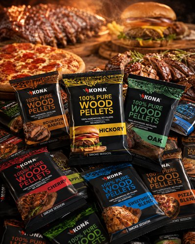
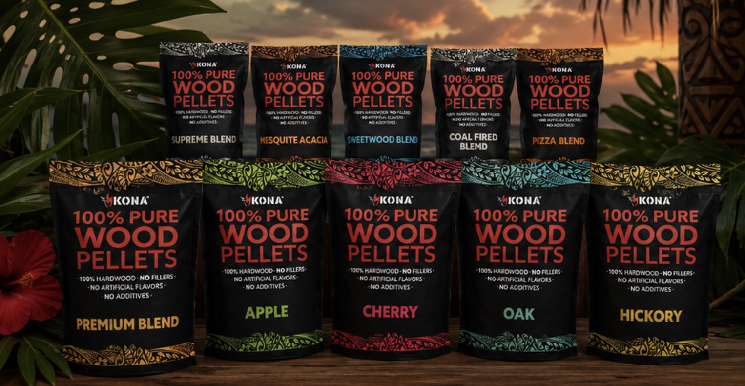
KONA wood pellet family lineup: ten flavor SKUs showing the packaging system, flavor color palette, and hand drawn tribal print
$1.28M+
Wood pellet redesign impact
+$37K
Amazon refresh, 4 products, 1–2 mo
7+ Years
Growing with the brand
01

Growing with the Brand

Seven years, four titles, one brand. My role at KONA evolved with the brand as it scaled, from a graphic designer supporting product launches to directing the entire visual world.

2019 · 2020
Graphic Designer
Joined the team supporting packaging and marketing design across a growing product line.
2021
Brand Identity Designer
Moved into identity work, focusing on building a stronger visual system.
2022 · 2024
Brand Identity Manager
Took ownership of the brand identity across every product and platform.
2025 · June 2026
Creative Director
Directed the whole visual direction, from packaging to campaigns to content.
Bold flavors. Good times. Island spirit.
02

Transforming the Brand Identity

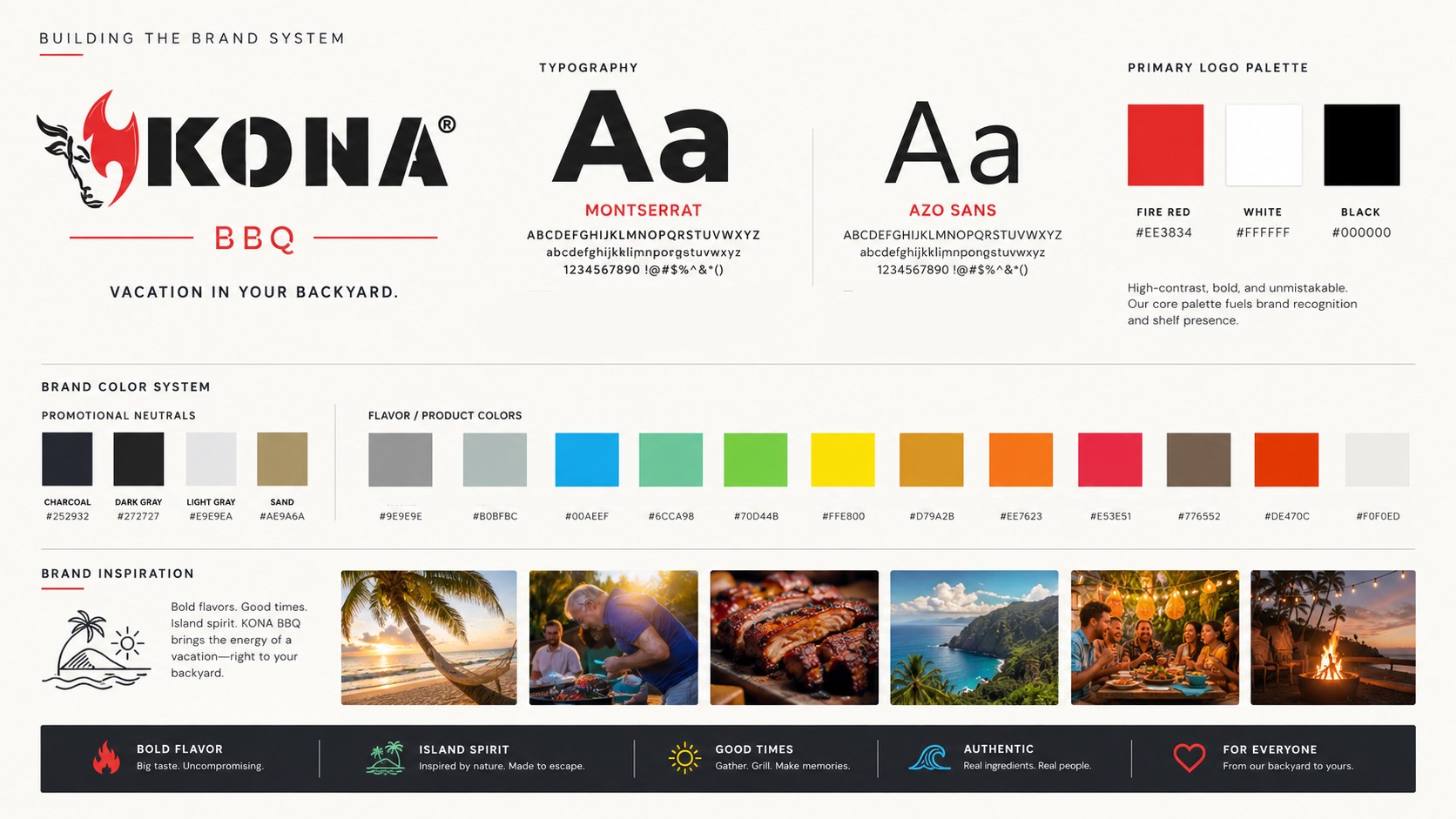
When I joined KONA, the visual identity was still forming. Over the years I took ownership of it, evolved it, and shaped it into the brand KONA is today. The direction I built blends bold typography, earthy textures, warm lifestyle imagery, and KONA’s signature “vacation in your backyard” energy, creating a brand experience that feels elevated, inviting, and made for outdoor cooking enthusiasts. As the design team grew, I set the aesthetic direction and guided a junior designer through storyboarding, A+ content, and social work, so the brand held together across every project.

KONA brand system: logo, typography (Montserrat + Azo Sans), fire red primary palette, flavor color system, brand pillars, and mood board

The elements at its core

Three visual anchors that make the brand instantly recognizable in a scroll or on a shelf.

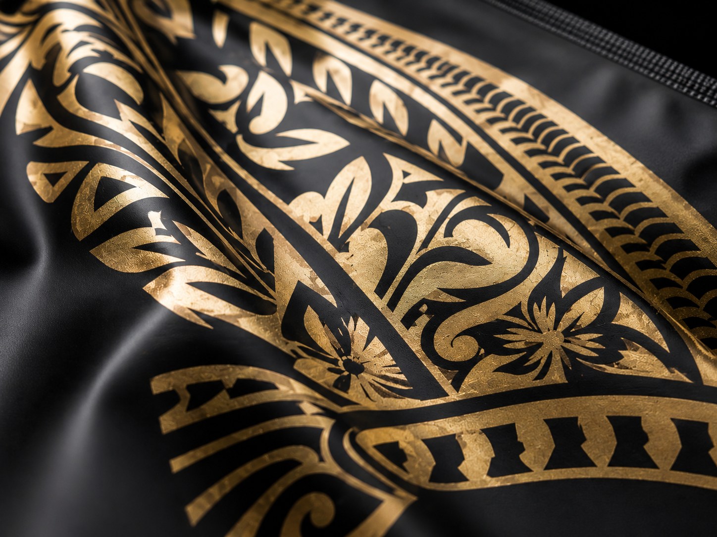
Detail of the hand drawn KONA tribal print in gold on black packaging
01 · Signature Element
The Tribal Print
A hand drawn motif I created that became KONA’s most recognizable design element. It runs across packaging, ice packs, box tape, and brand collateral.
Tagline
Vacation in your backyard.
02 · Signature Element
The Voice
The line that anchored the brand voice. Every campaign, product story, and social post lives inside this idea — bold flavors, good times, island spirit.
KONA wood pellet flavor family lineup showing the flavor-coded color system across ten SKUs
03 · Signature Element
The Flavor Color System
A color-coded palette that made every wood pellet blend instantly identifiable at shelf and on-screen — Premium, Apple, Cherry, Oak, Hickory, and beyond.
Vacation in your backyard.
03

Packaging Design

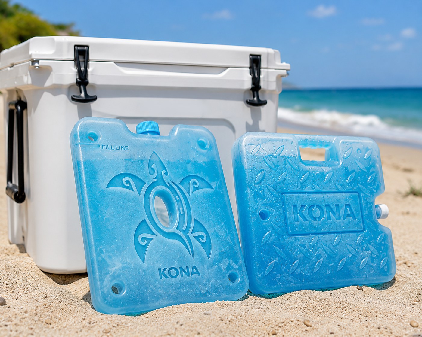
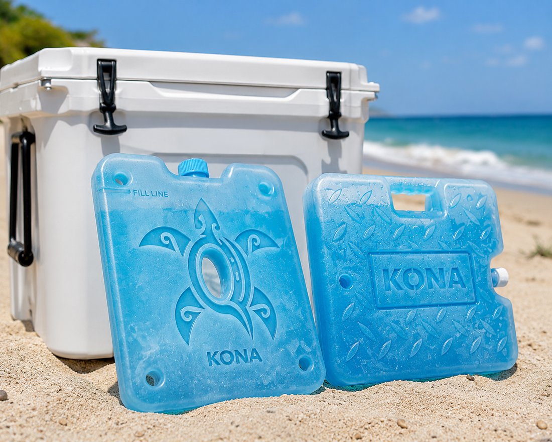
Across 50+ product launches, I designed a packaging system that created clear flavor differentiation while keeping a cohesive family look across the product line. This included the structure, typography, color system, icon style, and a custom hand drawn tribal print that became a signature visual element across KONA’s packaging and product designs. I also extended the system into KONA’s ice packs, creating custom molded graphics that brought the brand identity into a functional product format.

Beyond the Bag

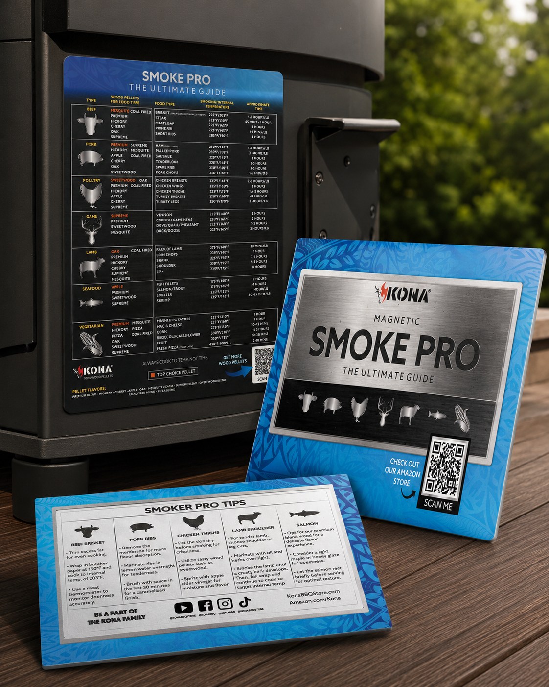
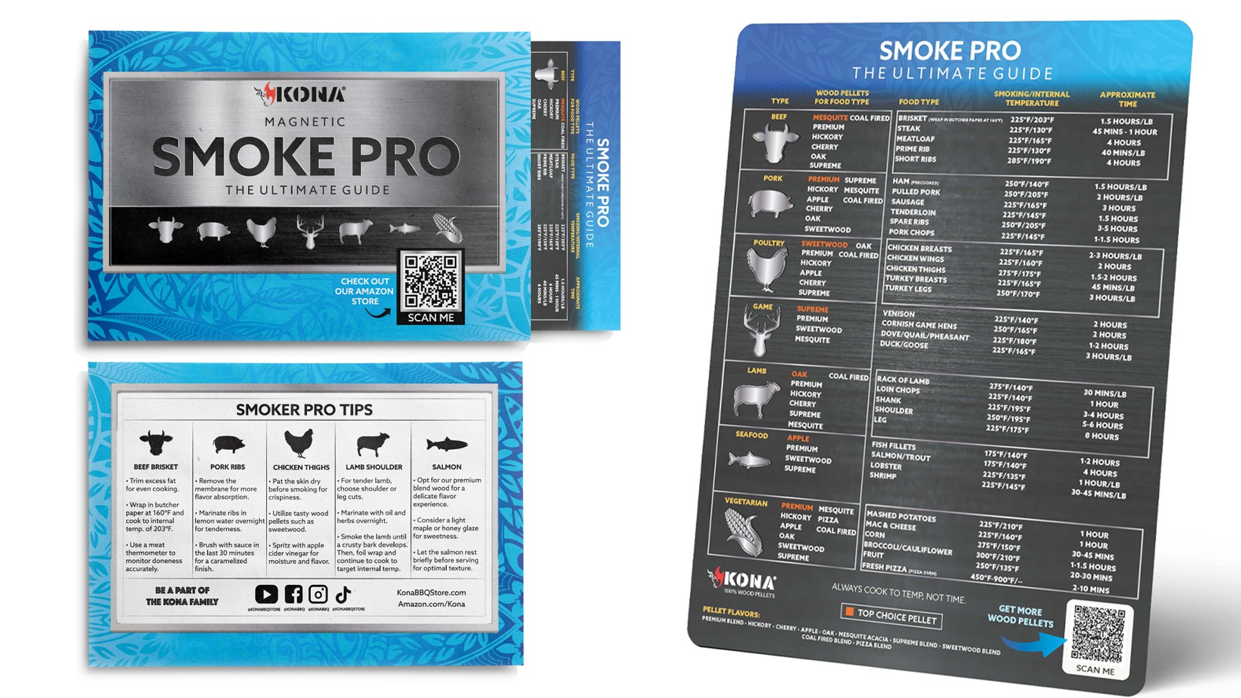
The brand doesn’t stop at the label. I extended the identity into every surface a customer touches after checkout, from custom box tape and limited-edition stickers to bubble mailer designs and the magnetic Smoke Pro guide that ships with premium orders. The goal: every unboxing feels intentional, on-brand, and worth sharing.

The design didn’t just look good. It moved.
04

Ecommerce & Campaign Creative

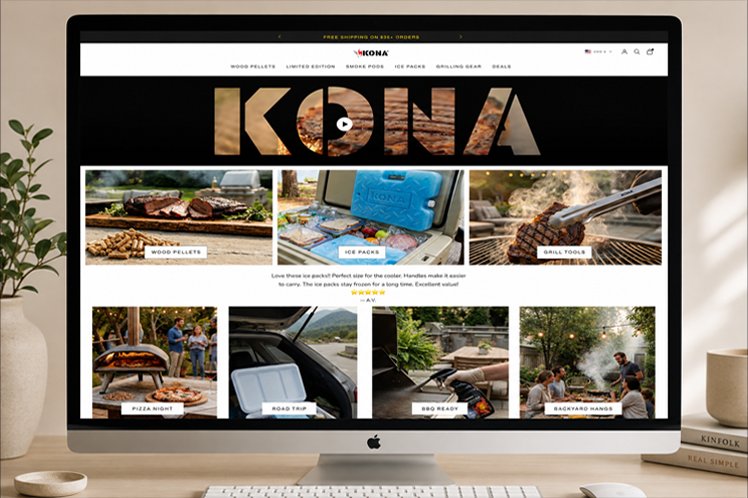
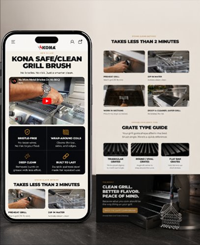
I developed conversion focused ecommerce and campaign creative across Amazon, Shopify, email, social, and product launch materials. From listing images and A+ content to promotional campaigns and launch visuals, each piece was designed to improve clarity, build trust, and help customers quickly understand the value of each product. I also designed and coded custom Shopify landing pages to turn product education into polished digital experiences.

The Amazon Shopper Journey

Every step a KONA customer takes on Amazon is a surface I designed. The listing that catches their eye, the A+ content that convinces them, the subscribe-and-save postcard that lands in their box, the branded tape they unwrap, the sticker they might slap on their laptop. The design work isn’t individual pieces — it’s one continuous experience.

01
Amazon product listing image
The Listing
Redesigned Amazon imagery drove the +$37K in additional sales across four products in 1–2 months.
02
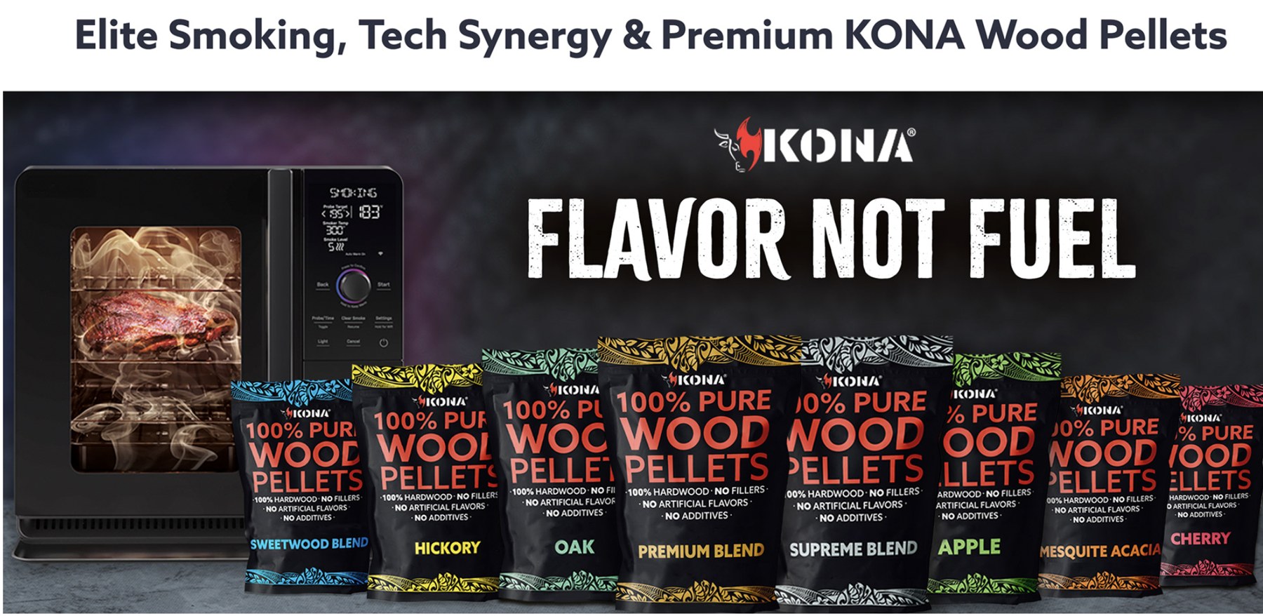
Kona wood pellet flavor family shown in A+ content
The A+ Content
Full flavor family and product education below the fold, designed to answer questions before they’re asked.
03
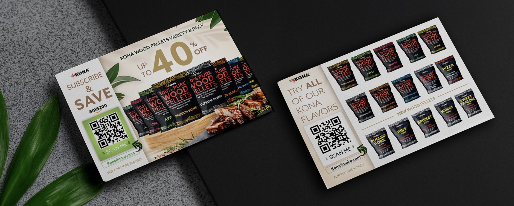
Subscribe-and-save postcard included in the box
The Insert Card
Subscribe-and-save postcards with QR codes to unlock more flavors and repeat purchase incentives.
04
Custom box tape + limited-edition stickers — add image when available
The Unboxing
Custom box tape and limited-edition stickers turn the shipment itself into a brand moment.
05

Social & Campaigns

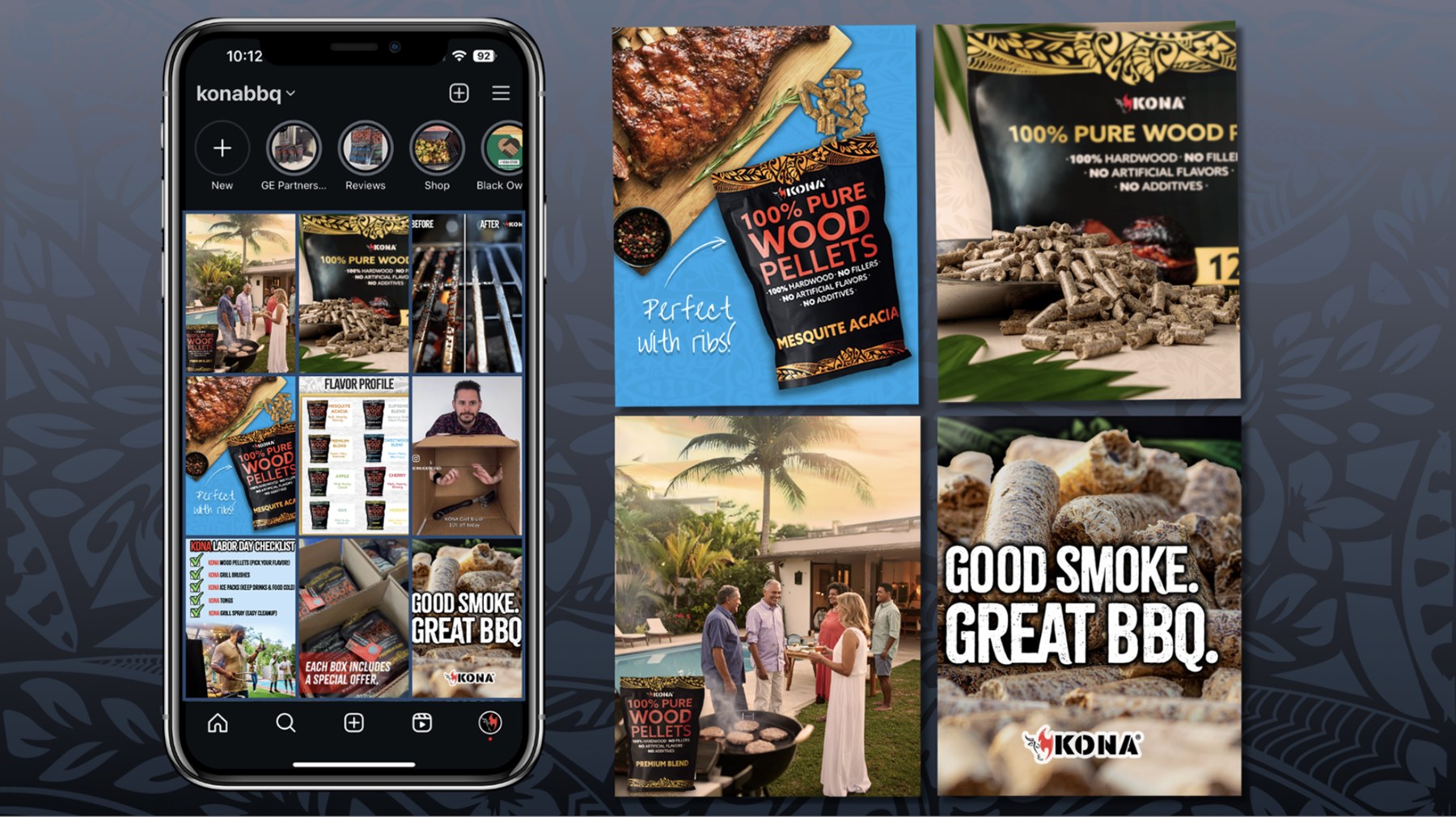
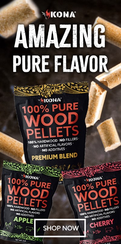
I built out KONA’s campaign creative and social presence to match the elevated feel of the packaging. That included leading co-branded campaigns like the GE Profile x KONA partnership, designing paid social across Instagram and Pinterest, and shaping an Instagram content system that turned the feed into an extension of the brand world.

Trusted to represent the brand externally.
06

Photography & Lifestyle

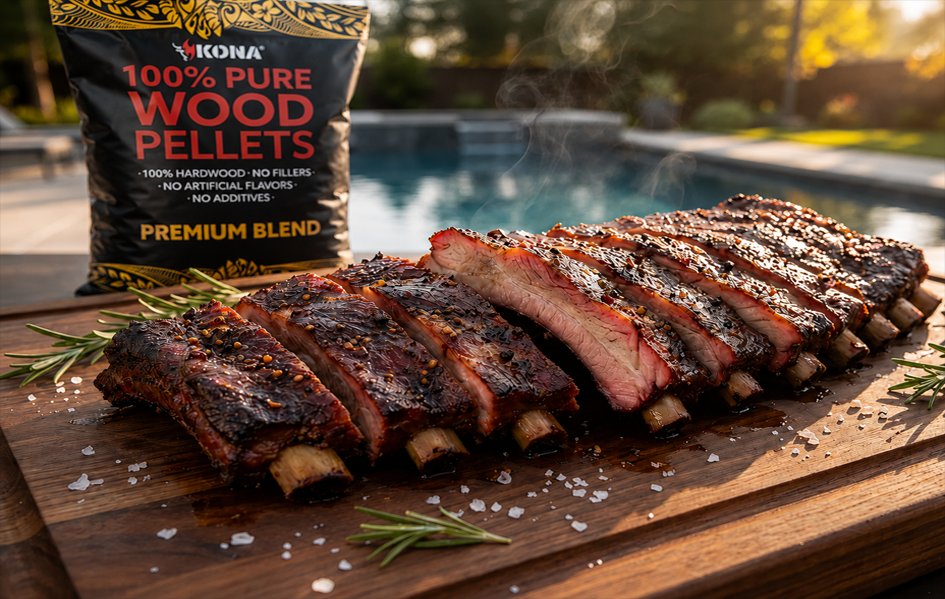
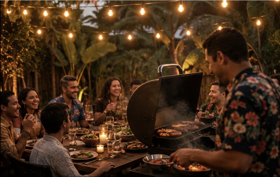
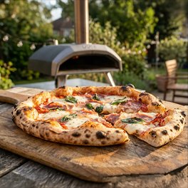
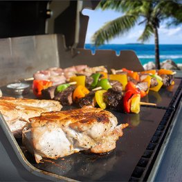
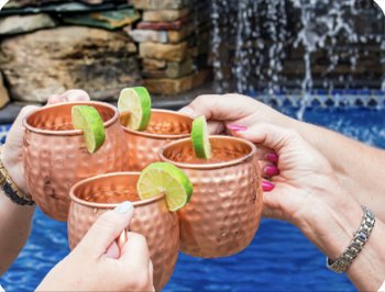
Lifestyle imagery played a key role in shaping KONA’s brand experience, transforming product visuals into a warm, inviting world of outdoor cooking, connection, and backyard escape. From food photography to styled product scenes, the imagery helped make the brand feel more experiential and emotionally engaging.

How the Work Gets Made

Design decisions at KONA weren’t made in a vacuum. Every listing, every packaging refresh, every campaign was informed by data, tested, and iterated. This is how the work actually happens.

01
A/B Testing
Every Amazon listing refresh gets tested against the incumbent. Winners ship, losers teach.
02
Metric Tracking
Sessions, conversion, BSR, and revenue tracked per product. Design tied directly to numbers.
03
AI-Assisted Workflow
Invested in ChatGPT and industry AI tools to streamline creative workflows and speed up iteration.
04
Trend Radar
Following Mindstream, The AI Report, Stacked Marketer, and Social Media Examiner to stay ahead.
07

Results & Impact

Design changes I made moved measurable numbers across KONA’s product line. Wood pellets alone drove $1.28M+ in annual impact, and a targeted Amazon image refresh across four other products added another $37,626 in additional sales in just 1–2 months.

Wood Pellets
$1.28M+In annual revenue impact
  • Full packaging redesign across the flavor range
  • Signature hand drawn tribal print as a brand element
12–18 month timeframe
Ice Packs 4lb
+$24KRevenue in 1–2 months
  • Units: 307 → 1,226 (4×)
  • Conversion: 7.12% → 10.50%
  • BSR: 13,300 → 3,599
Amazon image refresh
Pizza Pellets 2lb + 8lb
+$12.5KRevenue in 1–2 months
  • Units: 885 → 1,686 (nearly 2×)
  • Sessions: 5,107 → 8,915
  • Conversion: 17.33% → 18.91%
Amazon image refresh
Total Amazon Refresh
+$37KAdditional sales, 1–2 months
  • Across all four Amazon products
  • Systematic image refresh, not one-off
  • Driven by A/B testing and data
4 products, ~60 days
Seven years. One system. Real numbers.
Let’s work together →